When you think about food packaging designs to stand out on the shelf, you’d probably think of elements like size, color, and label. With snack packaging however, a lot of other factors need to be addressed. Since snacks is an umbrella term, it covers a wide variety of products from chocolates, to chips. Thus the packaging requirements are different too. Designers need to constantly keep coming up with good ideas to improve brand recognition and drive sales. The best snack packaging design will be attractive and do a splendid job of keeping the contents safe as well.
Key factors to remember for the best snack packaging
Making snack packaging designs attractive is one thing but it also needs to consider the unique needs of each snack. Packaging is used to tell your brand message, keep the snacks fresh and make it easy to display and transport. You need to consider all such factors when designing packaging for your snacks. If you want to design your own packaging, be sure to keep these essential factors in mind.
- Use your packaging to increase brand loyalty. Tell your company’s story and carve out your unique identity.
- The packaging should have form, function and beauty. When designing a packaging, it should be attractive but also functional.
- Ensure that the packaging complements its content. Some snacks are more fragile than others and can break during transit. Create a design that will keep them safe.
- Keep it simple. Don’t overload your labels with taglines and images. A clean and concise look that gets the point across is much better.
- Ensure that your design is versatile and can be easily transferred to packages of different sizes.
- Use creative designs to stand out with low cost designs. Come up with ideas that aren’t prohibitively expensive.
- Experiment with pattern and colors. You can change the whole look of a package by simply changing its color and patterns.
Best Snack Packaging Ideas
In the expansive world of snacks, there are thousands of brands and even more designs. And of course some are obviously better than others. With a little research and homework, you can educate yourself on how the most popular packages were designed. We’ve done just that here. This information will help you get an idea and choose the best packaging design for snacks.
1. Pringles
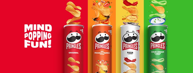
One of the best snacks packaging designs that is now famous worldwide. Pringles are sold in tube cans that are unlike any other. It has a cardboard body, an aluminum bottom and a paper top. The can comes in various colors and has an image of the brand name and the logo on the front. Illustrations of the chips are also on the front. The package keeps the chips safe and sealed tight for freshness.
2. Lays
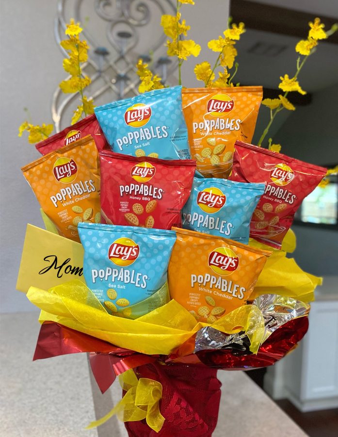
The popular brand, Lays sells their chips in bags. The design features food photography from a top down angle and a small logo. There is a little text and some additional visual elements to keep it simple. The packaging design feels very consumer friendly and is highly popular. It also leaves a lot of space in the package for gasses so that the chips can be easily transported without breakage.
3. Choco Stix
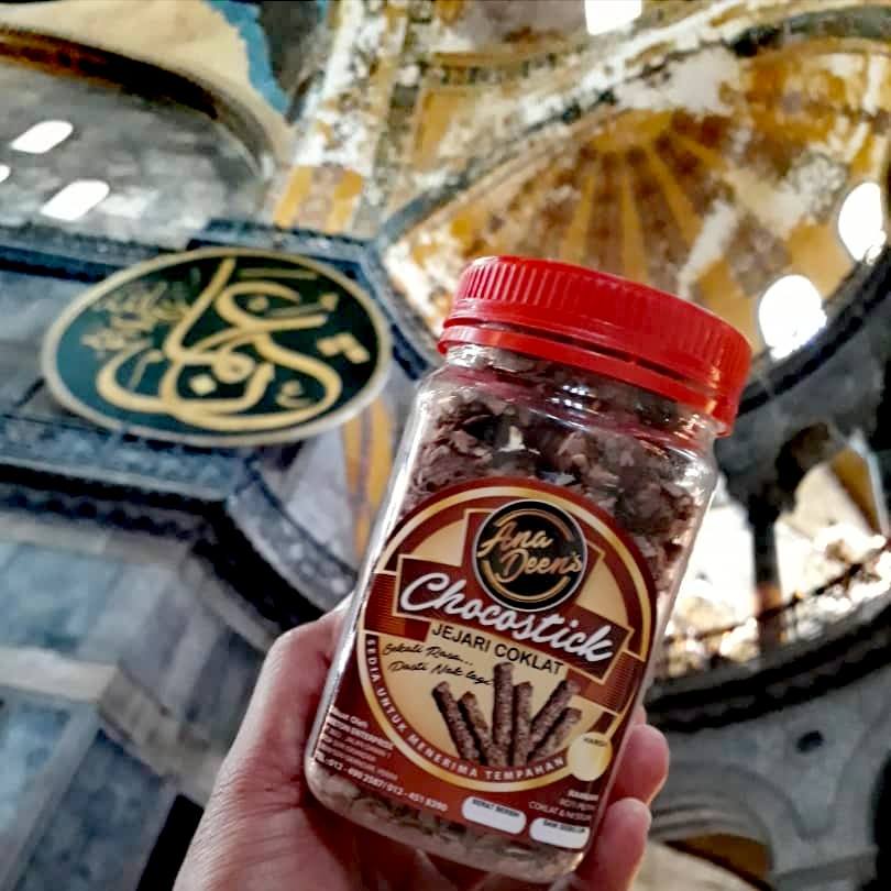
This chocolate snack packaging design features a fox as its prominent visual element. The long cardboard box has a striped top. The sides are strewn with choco sticks and stars. The brand logo is in the front in a chocolate brown color. The backside of the box is filled with a tagline and some additional nutritional information.
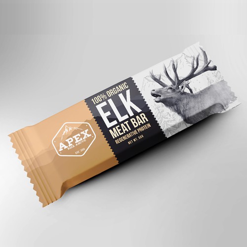
4. APEX Elk Meat Bar
This meat bar has a distinctive 3 columned front. The left area has the brand logo. The center has the name of the product and the right side has an image of an elk, the namesake of the product. The meat bar has a simple design and comes in an easy to open wrap. Its organic nature is also emphasized by textualizing it on the front.
5. Delicious Seaweed Rice Crisps
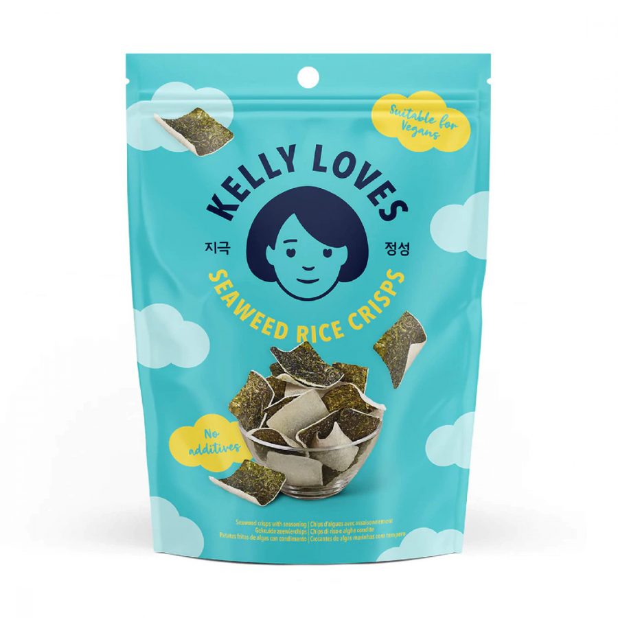
An eye-catching snack packaging design with a great color theme based on the flavor of the product. The rice crisps are packaged in a bag and prominently feature an image of a mascot carrying seaweed on their bicycle. The brand logo and the product name is just above the illustration while the flavor is on the right. There are also some images of flavored ingredients and the tagline on the bottom.
6. Affinity Nutrition
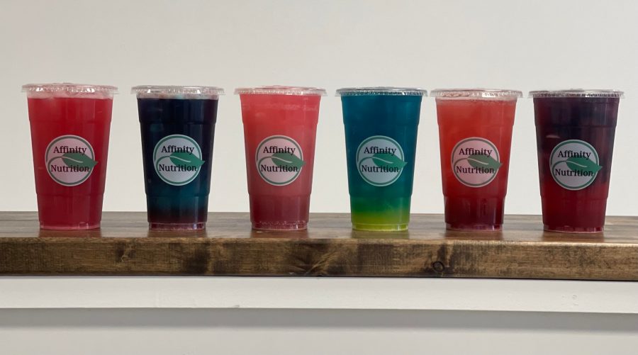
Afffinity’s protein bar is packed in a wrap. The design uses clever use of typography by using the varying size of the text to put more emphasis on certain things. The left side of the protein bar has an illustration of the flavor while the center has the product name. Its white and green color also highlights its natural production.
Get creative designs for your snacks at VOWELS
The global snack market has a valuation of over 700 billion dollars. To get a chunk of this lucrative market, you need a reliable packaging company to help you bring your products to life. At VOWELS, our aim is to help you succeed in your endeavors. And that is why our designers are dedicated to helping you determine the best snack food packaging for your brand. Our designers consider all aspects of the package such as its ingredients, material, cost effectiveness and attractiveness to bring you the most transparent snacks packaging design. We provide packaging that is easy to use, store and transport in a variety of shapes. To order your own snack packaging, contact VOWELS today.


