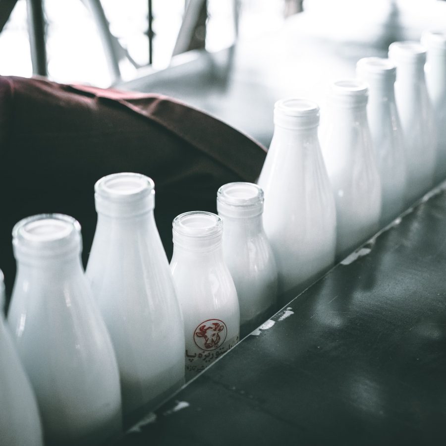
Filled with minerals and nutrients, milk is one of the most popular beverages in the entire world. However, when we imagine milk designs, the same old white milk carton or milk bottle is what pops up in our heads. There aren’t a lot of creative milk packaging designs that we see every day. This is because milk is a perishable item and is thrown out often. So, for milk companies, it doesn’t make a lot of sense to invest in the packaging of an item that is thrown out so often.
As a consumer designer packaging is always a plus point. People are even ready to invest a little more money for the same product if the design packaging is cute or unique enough. This is why both customers and milk companies should take a look at these best milk packaging ideas that we have come across.

The Features That Create The Best Milk Packaging Designs
There are some features that when optimized to their full extent give the best type of food packaging designs. In the case of milk packaging, these features are:
- Colours – Colours can be used in varying degrees to create the best designs for milk packaging. White has always been a popular choice for milk packaging products. When using white the company should pay attention to the intensity of whiteness as too much white will make it look similar to all the other milk packages in the store and too little white and the design would look stale or dirty. The use of colours like blue, green, and red amplifies the white in contrast.
- Freshness – There are some milk packaging that instantly gives a fresh and rejuvenating feeling. This fresh feeling is obtained from the colours used, the material of the packaging, and the illustrations on the packaging.
- Milk Symbol – These include cows, green fields, milk splash, cowbell, etc. They immediately give the impression that this packaging is the packaging of a milk product.
- Brand – This is the logotype that is used on the packaging. This helps in creating recognition and loyalty from its customers.
- Natural/purity – A seal from a recognized institution, green leaves, words, and figures of importance like 100% plant made give a testament to the quality of the product to the customer.
- Storytelling – The packaging design of Milk can be used to tell a story and enhance communication and establish a concept.
- Important information – The back panel of the packaging contains important information. Here is the info about the product and other interesting tidbits can also be put. The consumer should be able to understand the information very easily.
- Local – local products are fresher and hence are preferred over outsiders. The milk product packaging should show the local origin of the milk as well.
- Differentiation – To make the milk product stand out the design elements such as words, colour codes, etc have to be carefully chosen so that the consumer chooses this milk product over others.
1. SoyMamelle
The unique packaging of SoyMamelle is shaped like an udder. This design was cleverly chosen to show that though soy milk is not obtained from an animal it is similar in its qualities to that of cow milk. It is a 100% vegetative product with high-grade fibre, calcium, and no cholesterol. Not only does this product not have any cholesterol but it also helps in lowering the level of the body’s cholesterol level.
Other than the shape, the design is coloured with green spots and leaves design to show the message of nature and health that SoyMamelle represents.
2. Mountain Milk
Mountain milk is a student design created by Anders Drag. The fictional story behind this brand is that this bottled milk is from the mountains of Norway. The font on the bottle was specifically selected to represent the Norway roots. The milk bottle packaging design shows the mountains of Norway. This in combination with the natural features of the glass bottle shows a native vibe.
3. Bill’s Milkshakes
The maximalist cartoonist design of Bill’s milkshake packaging adds nostalgic value to it. There are three different flavours chocolate, strawberry, and vanilla and each packaging has a distinctive design. The illustrations are delightful to look at and the soft colours resonate with the soft and squishy feel of flavoured milk.
4. Arla Milk Bottle
The Arla Milk Bottle’s design story is the perfect example of how design made keeping convenience in mind always succeeds. When the consumption of milk in Sweden was dropping down, Arla Foods decided to make the design more convenient with easy to carry portable milk bottles. This milk carton packaging design was perfect for younger people who were always on the move.
Another advantage that was not foreseen by Arla Foods when designing this bottle was that a new target audience and market were unlocked because of the portable packaging. This was the lunch beverages market and the audience of people who carry lunch to either their workplace or schools. Therefore, because of the upgraded design, Arla gathered a lot of publicity.
5. Schroeder Milk
The Schroeder Milk packaging milk bottle design sports a clean-looking opaque packaging. On the pack, there are words like One, Two, Whole, and Skim written to reflect the fat level of the milk. To differentiate between the different kinds of milk colours are employed in a significant way. Eye-catching yellow, pink and blue colours are used.
The font is the use of rotting, esoteric phrases that make the Schroeder product easily differentiable from the other concept milk packaging designs in the market.
Interested in Milk Packaging designs? VOWELS can help you with your packaging design related queries.
Contact VOWELS for Your Milk Shop Business Plan
Make a name for yourself in the Milk shop business with a unique packaging design.
Our team at VOWELS can help you with attractive visual designs for your milk brand or your milk store. The right branding is key in building your milk business and with VOWELS your business will reach new heights. We combine originality and innovative designs to create milk packages that are ahead of the curve. Contact us today for your amazing milk packaging design!


