An actionable website plays a vital role in expanding business and increasing conversions. The main question is how you design a CTA-based website that attracts the intended audience, stands out from the competitors, and inspires action.
This article will teach the users the best strategies to develop and provide an attractive website that will boost conversion rate and generate income.

Use a Clear Call to Action
A call-to-action button is the most crucial element of any website that works as a guidepost. It helps customers pick their next step, thus creating a seamless pathway leading toward the end of the sales funnel.
A page may also contain several calls to action if there are several desired options. Add at least one CTA below after actionable content to drive lead generation. For instance, if there does not exist any clear call to action button underneath the blog article, the reader may exit the website without performing any other activity. One thing that can encourage the readers to continue cooperating with the website is when they see a CTA underneath the blog post, requesting to read the article further or enlist for an email newsletter.
Hire Best Web Design Agency Now!
Following are examples of calls to action that a user could find on websites:
- Start now.
- Enroll yourself.
- Free sample.
- Reach out to the audience.
- Post on social media.
- Buy Now.
How to Create Effective CTAs?
Start with a great design! A great call to action button must be eye-catching. Therefore, pick an adequate technique with a vibrant color button that should contrast with the page color or email.
Go for excellent visibility. The font size should be prominent enough to grab attention to make the CTA the most apparent thing on the page.
Give an evident advantage. A successful way of getting clicks is to emphasize a clear advantage user can find interesting.
Add operative text. CTAs are mainly designed to oblige the users to make a move. Therefore, functional CTA with action words is required, like discover now or learn more.
Take urgent actions. Creating a strong sense of urgency, such as putting a time limit on an offer, may oblige the visitors to make quick decisions immediately rather than delaying them.
Make Sure Your Website is Easy to Use
A website’s design should be easier to understand by the average individual while still giving the business an edge. If the website is simple, visitors may feel satisfied and avoid visiting the competitor’s website.
Following is the list that explains how to make a website easy to use:
- The navigation icon tells the visitor where they eventually are when they click. Therefore, all pages should have clear and concise navigation.
- Use a link checker in order to prevent broken links. In case a visitor enters the wrong URL for your website, we use a customized error page to show an informative message and sitemap instead of a malfunction 404 page.
- The company’s brand and color palette should be noticeable throughout your website. This is mainly to attract the audience to the website, especially when several tabs are loaded on their browser.
- Make sure the Website loading speed is optimal. Small-sized graphics and advanced codes make the website’s speed more acceptable.
Offer Something that Your Target Audience Wants
A website can select diverse types of offers and formats in accordance with its aims, vision, audience, product or service. Examples of some common types of offers are reductions in general prices, free samples, no shipping charges, incentives, warranties, and recommendations. Standard formats include coupons, tokens, posters, homepage banners, and emails. A brand should select the type and style of offer that suits their situation and line up according to the intended audience’s beliefs and likings. Test and improve the offers to determine which works best for your website.
The offer should be clear, brief, and compelling to encourage your intended audience to act quickly. The websites use headlines and subheadings to get the reader’s attention and help deliver their offer’s main advantage. Bullet points and lists represent the elements and benefits of the offer, while sentimental points and vital phrases touch the intended audience’s sentiments and requirements. In addition, use features such as social proof or comments to cultivate viewers’ faith in the company, and make sure to include a conspicuous call to action (CTA) to guide your audience about the next step they should take.
Client Example:
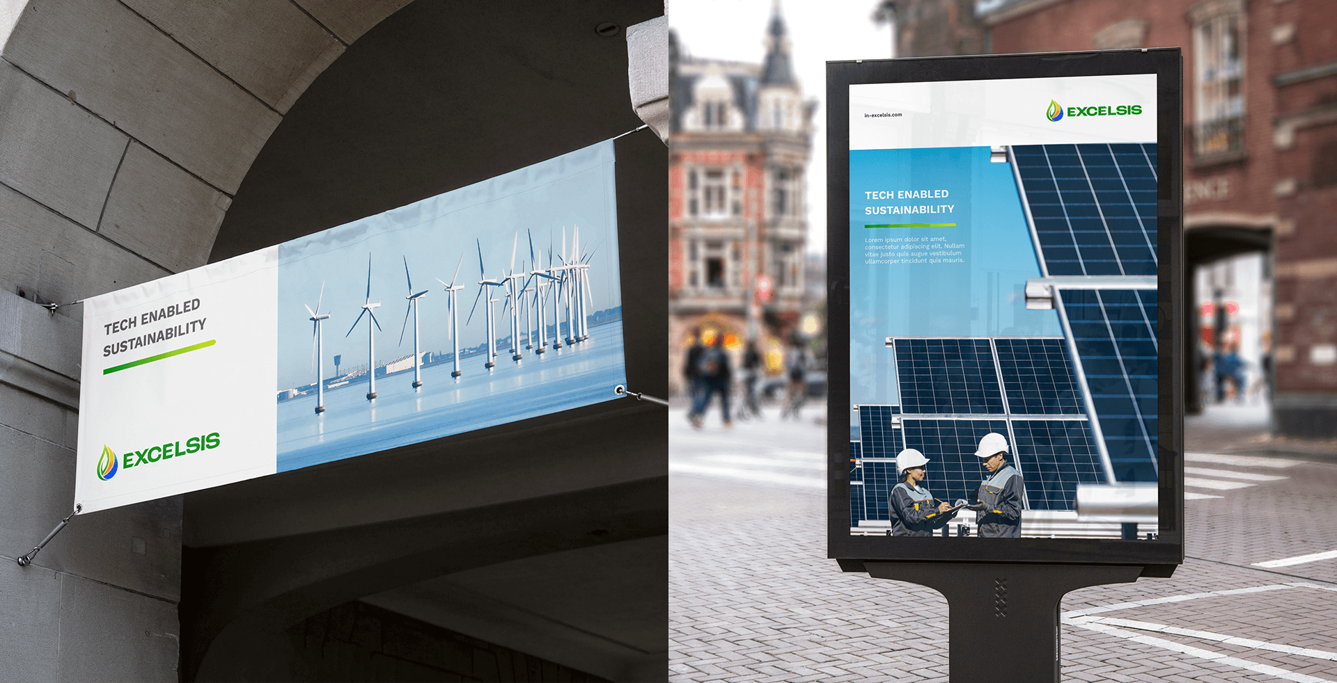
Excelsis: Website Rebranding
We rebranded Hansa Global’s website to Excelsis Business Solutions. We provided them with an updated theme idea according to their business concept. The new theme symbolizes the brand’s unique creativity. After that, we merged this idea into their symbol and website’s design. We gave the client a clean format, an excellent UI/UX design, and an effortless font style. The website is user-friendly and functional due to our attractive call to action button.

Work with Vowels
For making a great website that turns leads into clients, you can use several ways to attract your audience, like adding offers, creativity, or CTAs. With the assistance of some specialists like Vowels, you can quickly develop a functional website that can attract, engage and convert the audience.
Click here to book an appointment.
FAQs
1. How does conversion happen?
Website conversion happens when a user finishes his desired activity on the website, such as purchasing an item or filling in details in a contact form.
2. How can I attract an audience to my website?
- Make use of the content organizer.
- Concise your forms.
- Incorporate social media.
- Track the number of people who visit your website.
- Include live conversations.
- Examine your proposals.
- Performing A/B experiments.
- Build trust.
3. Can you guide me on how to develop a website?
Yes, with our guidance, you do not have to acquire any skill or knowledge. We can start from the beginning, and our process is simple and uncomplicated. Our expert team makes developing much more accessible by adopting all the efficient practices that increase conversion.


